Search This Blog

Wednesday, November 24, 2010

Painting Abstraction: Barriers

photo
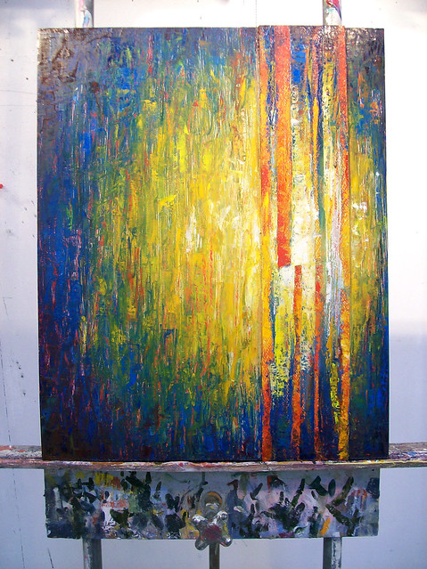
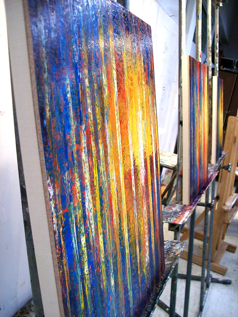
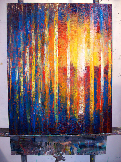
Barriers, 3 wood panels, 16"x20"

photo
Barriers, #1


photo
Barriers, #2
photo
Barriers, #3
This is an abstraction series that I did for my painting class. The premise is an interpretation of self, and represents where I feel my life is at right now. I am attempting to figure out where my life is going, and this abstracted scene of bars and water horizon line are a metaphor for if I am looking at the barriers in life or the opportunities. As the paintings progress, the barriers begin to recede, showing that as our perceptions of life change, the barriers themselves change, until we no longer see what is holding us back, but what is possible and available for us if we are willing to see it. The concept for me is very important because I truly believe the way we perceive life shows a lot about our characters, values, and motivations in life.

Sunday, October 17, 2010

Entirely Oats Product and Packaging Design

This is a recently completed packaging project for a fictitious company called Entirely Oats. The concept is based on reinventing oatmeal for consumers while maintaining its wholesome nature. Using old fashioned oats, dried fruit, and vintage inspired packaging with a modern twist, the entire feel works toward promoting an interesting new take on a long standing product. The labels are screen printed on paper bag type material. Flavors are: Just Peachy Peach, Cravin' Craisin Raisin, and Fan of Banana! There is also a measuring glass cup included inside for convenience. I am very excited about the final result of Entirely Oats and hope you enjoy viewing!

Sunday, October 3, 2010

Greensense T-shirt Design

I did this t-shirt design for UW-Stout's environment student group Greensense this fall. It is very graphic and 70s inspired. I really like the simplicity of the design and vintage feel it has in a modern way. The illustration shows a tree and the earth.


Friday, September 17, 2010

Fall 2010 Greensense Poster


This is a new poster I did for the Greensense environmental student group at Stout. I played with the wood texture, and the effect of virtual woodcarving and spray painting. It was a fun little project.

Tuesday, August 17, 2010

Revised Self Portrait


Since posting my final Life Drawing Self Portrait project last May, drawn from a mirror, I have revised the contour line drawing into a value drawing. Using the contour lines I created previously, it helped me to resolve three-dimensionality issues in how to shade the drawing in a realistic way to create volume. If you compare my previous contour drawing to this revised value drawing, you will be able to see the shapes here that were devised in line in the other drawing.

Thursday, August 12, 2010

NASA Internship Webcast Video

I am very happy to be able to post the video I worked very hard on during my internship at the University of North Dakota this summer. The internship was 2 months long and consisted primarily of classes, research, and video production. Funded by NASA, it was called Communicating Climate Change, and the goal of my 9 fellow interns and I was to create 4 different webcast videos, of 5-7 minutes each, focusing on different environmental issues. All the preliminary research, scripting, storyboarding, graphics, music, video shooting and editing, was done by us. In short, from start to finish we did the work to put the videos together. The future purpose of these videos is for teaching middle and high school students about climate change, and to stimulate discussion topics relevant to the presented issues. My partner, Korey Southerland, and I produced the video on Land Use Change. Please enjoy!

See Global Climate Change Videos here!

Wednesday, May 12, 2010

Final Portfolio Summary

Self Portrait (5/11/10) - drawn by looking at a mirror, pencil

I believe over the time of the course I have achieved the objectives. I worked hard to learn how to draw the body, and how it is formed by its underlying structure. Repeatedly practicing drawing, the spine first, then the rib cage, then the pelvis, etc, helped to learn why the body is shaped the way it is at different angles. And this has helped me to be able to draw and sketch much more quickly the human body in varying positions, because I understand so much more about how the body moves. Learning how to draw effective contour lines taught me a lot about the undulating curves and dimensionality of the human form as well. It was difficult at first to be able to look more critically at what I was drawing and translate it to a 2D surface in only line work.

What I needed to work on the most since midterm was my shell drawings. I feel like they have definitely improved, because I have had more practice drawing my shell, and it was a very unfamiliar form for me at first. The angles and perspective of the shell are more dynamic, and more accurate in especially my last shell drawing. The last two shell drawings were more difficult because ink was added, but I like my last shell drawing the best, since I knew better how to work the ink, I think it is much more effective as a medium in the fourth drawing.

As a Graphic Design major, I will use what I have learned in life drawing in the future because I learned some valuable skills. I have learned so much about the human body, and how to draw the body anatomically accurately. Since I have always liked to draw, this helped me to learn new ways to approach the medium. Especially new to me was drawing with contour lines so much, because it taught me how to see dimensionality with a much more critical eye than value shading. Anytime I need to do any sketching, or incorporate drawing a 3D form into my work, I can use some of the knowledge and skills I learned. Aside from my major, though, I really enjoyed the class, and I will implement things I have learned in my future work, whether specifically Graphic Design or not.

Links to my Final Portfolio:
Maniken

Gesture Drawings

Homework

Long Drawings

Anatomy Sketches

Tuesday, May 11, 2010

Type in Motion - Project 3

Key Network from Kelli Fox on Vimeo.


This is my latest Type in Motion project. It is for my invented Key Network, a crime and mystery show channel.

Sunday, May 2, 2010

Skull Studies


These skull drawings show three different angles: profile, 3/4 back, and 3/4 front. The skull is a tricky part of the body to draw, because its shape is deceiving. The back of the skull extends much farther than it would at first appear, and the eyes are lower on the skull than might seem. It is very interesting drawing the skull, because it is the underlying structure for the face and head, and it is interesting to see what is the bases for our outer features.

Monday, April 26, 2010

#2 Ink Shell Drawing


This shell drawing I feel was more successful than my first shell drawing. I did not wash out the entire surface as I did on my last one, and this helped maintain lighter areas and more contrast overall. I really liked the brown ink with reddish-brown conte on my last ink wash shell drawing, and so I kept the combination for this one. What I really enjoy about the brown ink is the way it reveals other colors when saturated with water, such as the fuscia tone seen on the bottom of the shell here.

Monday, April 19, 2010

Maniken Update


This is my maniken, whom I chose to name the Half Blood Prince within 3 seconds of deliberation. So far I have been able to get much of the torso, quad, and calf areas complete. I am currently working on the upper body and arms.

Fashion without Fabric


(photos courtesy of Emily Brownson)

Throughout this semester, I have been coordinating the Fashion without Fabric show, which was held last Saturday, April 17th, at Stout. This event showcases Stout's art and design students' creations of ensembles that contain no fabric. As such a large show, with 79 ensembles and over 150 students involved, it is quite a treat for the audience, as the students created some spectacular garments and showpieces.

And even through the craziness of coordinating it all, the show was really a blast and I'm excited to do it again next year!

Monday, April 12, 2010

Shell Drawing with Ink #1


This is my first shell drawing using ink. I used two colors of ink, black and brown, as well as reddish-brown and white conte. I experimented layering the ink, starting lightly and adding in to create contrast. I had a lot of fun with the ink around the shell, and playing with dripping the ink. Really wetting the paper well before starting helped make the ink apply smoother. There is a very impressionistic quality to the ink, since it is similar to water color, it has less control than acrylic paint. I added more contours of the shell after I had added the ink to make them stand out more. This was a fun experiment to create the shell in a new way with ink.

Wednesday, March 31, 2010

A Few Recent Projects of Mine

Untitled from Kelli Fox on Vimeo.


Daffodils from Kelli Fox on Vimeo.


Poster for Earth Week environmental events happening on campus for Greensense. List of 3 movies being shown in Applied Arts.


Poster I designed for the Fashion without Fabric show, which I am also coordinating. If you don't see it at first, there is an "H + V" in the poster, representing the theme, Heroes and Villains.

Tuesday, March 30, 2010

Spring Break


Over Spring Break, I was able to make a visit to the Minneapolis Institute of Arts. I had forgotten how much art was really there. I especially enjoyed looking at the Chinese Export Porcelain. It is very beautifully handcrafted. I also particularly appreciated this Art Nouveau Pedestal/Plant Stand by Gustave Surrier-Bovy. The interesting curve of the spine of the stand sets it a little off kilter in a quirky kind of way.

Saturday, March 13, 2010

Life Drawing I Midterm Portfolio

Link to my Life Drawing I Midterm Portfolio:

http://www.flickr.com/photos/34323108@N03/sets/72157623485384973/


During the semester so far, I have liked the flow of the class. By starting with only the spine, and adding bones and muscles gradually to gesture sketches, it really helped my to build on what I was learning. And through warming up with gestural sketches, I formed a more general idea of what the overall shape of the body should be, and then work on a longer pose. I enjoy the long poses the most, with adding the contour lines, which make me look closer at the form of the body. By being forced to draw the dimensions of the body in lines, I have to really look closely at the curves of the bones and muscles in the body.

My strengths I believe are attention to detail, careful observation, and controlled line quality. What I have the hardest time with is getting the right overall shape, size, and placement right of what I am drawing on the page.

I would like to improve my knowledge of the underlying structure of human anatomy to better understand how to draw the body. I would also like to continue getting better at making my long pose drawings more accurately proportionately and otherwise. Continuing to be patient with my drawings will also help me to look closer at my subject matter and see more details.

Sunday, March 7, 2010

Shell Drawing #1


This is my shell drawing using contour lines and variation in line weight to create a 3D look. The lines curve with the form to show the full roundness and shape to the shell. I looked very critically at the form and tried to draw the details accurately to create a likeness of the shell. The varying light and dark lines help indicate the form.

Wednesday, February 24, 2010

Less is More

At my visit to the Walker Art Center, I took the time to observe the following piece:

Robert Irwin
Slant/Light/Volume Exhibition
untitled, 1971
synthetic fabric, wood, fluorescent lights, floodlights
96 x 564 in.
Collection Walker Art Center Gift of the artist, 1971


(images courtesy of http://calendar.walkerart.org/canopy.wac?id=4671)

Robert Irwin's work in the mid-1960s helped develop and define the guide for the West Coast Light and Space movement by exploring how we consciously perceive phenomena. Although the design of the architecture seems simple, there is great psychological intent in the reasons for the aesthetics and construction. The overall experience of the viewer is really the main focus of his work, because he says that his work is not complete without viewer participation within the space. It is all about how people interact with the work in physical, sensory, and temporal experience of space.

He started using a translucent scrim in the 1970s, a fabric used in theatre productions, which is opaque unless lit from behind. This is used in this piece to give depth to the composition of space. When I entered the gallery, I loved the open and calm feeling of emptiness. It was not empty in a dull way, but in a tranquil and reflective way. It allowed me to relax, sit down, and appreciate the simplicity of the space. When I sat looking at the fabric stretched diagonally in front of the space behind it, I didn't even really think about the fabric. Since the fabric was so taughtly stretched, it was completely smooth, and so I was tranfixed on the space behind it, which was visible because of the fluorescent lighting. It made me want to walk through the fabric, because it is almost an optical illusion of space, you hardly even notice that there is a barrier between the two spaces the cloth divides.

Overall, I loved the simplicity and tranquility of this piece. It was void of chaos and distractions, providing a nice contrast to the business of the modern world. The calmness allowed me to slow down and just relax and think, and I appreciated the purposeful interactive quality of the work. In the words of the artist, "From a phenomenological viewpoint, to make the observers necessary to complete the quality quotient of art is probably the most human, the most emotional, the most sensory thing to do."
Thursday, February 18, 2010

Contour Drawings


These are contour drawings from this past week. We have now begun to add form to line drawings by adding more contour lines to create a 3D look. I started shading and darkening parts of the line, and keeping other parts light to create a more dimensional appearance of the form. The contour lines must be very sinuous to make the body forms appear to have some shape.

Thursday, February 11, 2010

Shell Savvy


My shell is a conch shell of the family Strombidae and the genus Strombus. The word 'conch' is a derivative from the French language of a Greek word pertaining to any kind of shellfish or shell. It's scientific name, Strombus gigas, means 'giant spiral shell.'

Kingdom: Animalia
Phylum: Mollusca
Class: Gastropoda
Order: Mesogastropoda
Family: Strombidae
Genus: Strombus
Species: gigas

Queen Conchs usually mate in warm shallow waters in the Caribbean on sandy surfaces behind coral reef areas. When the embryos leave the egg, they float for about 3 weeks until they are about the size of a grain of sand and lose their swimming ability. They then sink to the bottom of the ocean floor. The water movement and sandy environment probably contributes to some of the weathered texture on the outside of the shell.

The shell is a growing organism while the mollusk inside it is alive. The konk is a gastropod, an invertebrae, that is a soft-bodied mollusk protected by a very hard shell. It grows 3 inches a year during its active growth phase, maturing at about 8 inches long.

Thursday, February 4, 2010

Spinal Contours


This image is a contour drawing focusing on the positioning of the spine. I looked at how the curvature of the spine effected the entire body positioning. It is interesting to see what absolutely essential role the spine plays in the movement of the body, and drawing that accurately sets up the entire drawing. The spine is not stiff and straight like a ruler, but it is sinuous and flexible, even when people are standing straight up. By really concentrating on this flowing, curving line, my drawings took on a more natural look in capturing positioning. I am really interested in learning more about the anatomy of the human body, because it is already making me look more critically at the human form in my drawing. It will continue to help me understand the underlying structure to see the little juts and curves as muscle and bone shaping the body. With my contour lines around the torso, I was trying to figure out the 3D roundness of the body. I am also just excited to be drawing again, and I think the human form is a very interesting subject to study.

Tuesday, February 2, 2010

Blind Contour and Continuous Line Drawings


The first drawing is a blind contour drawing. It is interesting to see what happens when the eye to forced to work in a different way with the hand. The process can be a bit frustrating, because it is not as easy to control the outcome of the image. So it looks strange and disproportional, but new details are caught by slowing down, and it has a nice quality. Since the drawing is so light, try viewing the larger image to see more detail!

The five words I would use to describe this composition would be:
1) for value: light
2) for speed: moderate
3) for character: controlled
4) for pressure: soft
5) for another descriptive word: sketchy

The second drawing is a continuous line drawing. This drawing I tried to practice blind contour as well at first, and then went back to rework afterward. I liked the effect of this, and I was surprised at how accurate some of the details were in the drawing, even though proportions are slightly off. Keeping a continuous line was difficult, because I wanted to be able to stop and start, but it helped as an exercise to draw the outline of the form.

Wednesday, January 27, 2010

Introduction


Hi. I'm Kelli. Welcome to my blog. It will be a spot for portfolio work and Life Drawing pieces. I am a Graphic Design Junior at UW-Stout. I am also working towards a minor in both Business Administration, and Sustainable Design and Development. These are a couple of works I have created. Top is a charcoal drawing, middle is a poster for a nonprofit organization which is part of a larger GD project, and the last is a wordmark.

I am taking Life Drawing to learn more about how to draw the human body. I love to draw, especially people, and it's exciting to take a break from technology and spend some time with paper and pencil. I really hope to learn a lot about the human form and musculature as well, which I think will be really beneficial.